Shop on Lazada
Spakct products
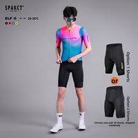
Spakct | Men Summer Cycling Jersey for Road Bikes
₱4,315.98₱10,026.95
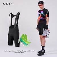
Spakct | Breathable Lightweight Quick Dry Cycling Jersey
₱6,514.01₱8,426.93
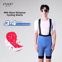
Spakct | Shock Absorption Cycling Bib Shorts For Men Spring and Summer
₱1,542.83₱4,508.12
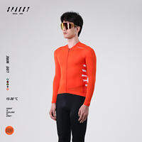
Spakct | Antibacterial Thin Spring Summer Mens Cycling Jersey
₱1,616.87₱5,549.29
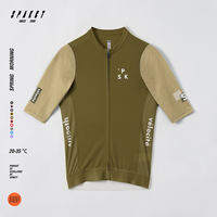
Spakct | Mens Quick-drying Cycling Clothes Summer Road Biking Shorts
₱4,201.24₱6,529.12
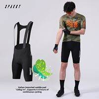
Spakct | Short Sleeve Professional Cycling Jersey for Men and Women Summer
₱6,692.19₱8,427.16
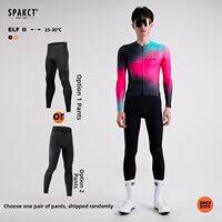
Spakct | Professional Cycling Suit For Men Long Sleeves Long Pants
₱4,520.99₱10,566.11
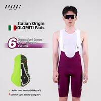
Spakct | Professional Long Distance Cycling Shorts with Breathable Strap Design
₱3,189.98₱8,110.57
About Spakct
Spakct (Chinese: 思帕客, often styled SPAKCT) is a Chinese cycling-apparel and lifestyle brand based in Shenzhen, Guangdong. The label is primarily recognised for cycling jerseys, bib shorts, gloves, and riding equipment that combine functional performance with colourful, original graphic design.12
Note on the name: Public sources sometimes spell the brand as “Spakct,” “SPAKCT,” or occasionally “Spakc/SpakcT.” The current official site uses Spakct.1
Overview
| Field | Information |
|---|---|
| Brand name | Spakct / SPAKCT |
| Chinese name | 思帕客 |
| Industry | Cycling apparel and sporting goods |
| Origin | Shenzhen, Guangdong, China |
| Associated company | Shenzhen Lugge Culture Communication Co., Ltd. (深圳市路歌文化传播有限公司) |
| Design organisation | BONA Design Center / BONA design studio |
| Known for | Cycling jerseys, bib shorts, gloves, cycling accessories |
| Brand positioning | Performance-oriented, colourful and design-focused cycling apparel |
| Current slogan | “Ride with vitality. Ride Spakct.” |
| Official website | spakct.cc |
Corporate and industry profiles identify Shenzhen as the brand’s headquarters and origin, with Shenzhen Lugge Culture Communication Co., Ltd. listed as the trademark holder.27
History
Spakct emerged in the Chinese cycling-apparel market around the late 2000s. Several industry profiles date the brand’s establishment to 2009, while earlier cycling-industry coverage documents Spakct products and design activity from the early 2010s.3
A significant component of the brand’s early identity was its BONA design studio, which focused specifically on developing cycling clothing. Rather than treating jerseys merely as sports uniforms, Spakct positioned them as a combination of athletic equipment, graphic design, and lifestyle expression.2
By the early 2010s, Spakct was producing technically oriented cycling apparel. A 2013 review of its “Glas” jersey noted features including a three-dimensional cycling cut, moisture-wicking functional yarns, digital transfer printing, reflective elements, and specialised zippers.4
The brand also became notable for incorporating Chinese cultural imagery into contemporary cycling design. Its “True Dragon” series, discussed by Chinese cycling media in 2012, utilised dragon imagery alongside traditional calligraphic and ink-inspired visual elements.4
Meaning of “Spakct”
According to Chinese brand profiles, the name Spakct was derived from the English word “spaker,” associated by the brand with being active and energetic, combined conceptually with “客” (kè), meaning a person or member of a group. The resulting concept describes a community of energetic people who love healthy activity and move forward positively.2
This aligns with the brand’s Chinese identity, 思帕客, and its emphasis on cycling as an active, healthy lifestyle rather than solely transportation or competition.
Brand philosophy
Spakct’s stated philosophy centres on three broad ideas:
- Sport — encouraging participation in cycling and physical activity.
- Environmental awareness — associating cycling with an environmentally conscious lifestyle.
- Health — promoting active, healthy living.
Chinese descriptions summarise the product philosophy with concepts such as “乐活、环保、生生不息,” translating roughly to lohas/healthy living, environmental responsibility, and continuous vitality.2 The international website expresses this simply as: “Ride with vitality. Ride Spakct.”5
Design philosophy
Historically, a distinguishing characteristic of Spakct has been its visual design. While many cycling brands emphasise understated colours and conventional racing aesthetics, Spakct developed a reputation for bright colours, graphic patterns, illustrations, and culturally inspired designs.
Its BONA design team has been central to this identity, with historical coverage describing BONA as responsible for original cycling-apparel designs that combine Chinese cultural themes with contemporary sportswear.1
Chinese cultural influence
The “True Dragon” series exemplifies this approach. The collection incorporated dragon imagery, traditional Chinese visual symbolism, ink and calligraphic aesthetics, purple, black, and blue-gold colour combinations, and modern cycling silhouettes. This deliberately differed from conventional European-style racing graphics and helped establish Spakct’s reputation for original Chinese cycling design.4
Demonstrating further interest in Asian cultural references, Spakct produced a Bruce Lee 70th-anniversary cycling jersey in 2010 and a “Hua Long” (Chinese dragon) themed jersey in 2011.4
Products
Spakct’s core business is cycling apparel, though its range has expanded into related riding equipment.
Cycling clothing
The current international catalogue includes:5
- Short-sleeve cycling jerseys
- Long-sleeve jerseys
- Bib shorts
- Cycling shorts
- Bib tights
- Thermal tights
- Skinsuits
- Base layers
- Cycling T-shirts
- Women’s cycling apparel
Examples on the current website include the Metropolis Jersey, Infinite III Jersey, Innocence Jersey, Kunpeng Jersey, Star Journey Skinsuit, Aoyama Bib Shorts, and Horse Thermal Bib Tights.1
Accessories
Spakct has also offered cycling gloves, neck gaiters, headwear, cycling bags, and other accessories. Historical product information documents cycling-specific features such as reflective strips, anti-slip elements, moisture-wicking fabrics, and specialised zippers.14
Technical approach
Although design is a major part of its identity, Spakct has historically marketed its clothing as technical cycling equipment rather than fashion apparel. Documented product features include:4
- Moisture-wicking fabrics
- Quick-drying materials
- Breathability
- Anatomical/three-dimensional cycling cuts
- Reflective detailing
- Anti-slip waist elements
- Multiple rear storage pockets
- Specialised cycling zippers
- Digital-transfer graphics
For instance, the 2013 “Glas” jersey used functional yarns designed for moisture management and included reflective elements and a cycling-specific three-dimensional cut.4 This gives Spakct a hybrid identity combining performance cycling clothing with graphic and fashion design.
BONA Design Center
BONA is one of the most important names associated with Spakct. Historically, the BONA design studio was described as a specialised organisation focused on cycling-sports apparel development and design.2
The current international Spakct website continues to prominently identify BONA with the brand, describing the designers as cyclists themselves who commute, ride on weekends, and test products through actual riding experience.5 This reflects the brand’s positioning of its designers not merely as fashion designers but as cyclists designing for cyclists.
Manufacturing and supply
Historical supplier information indicates that Spakct products have been manufactured in Shenzhen, China, within the city’s extensive apparel and sporting-goods manufacturing ecosystem. One manufacturing profile associated with Spakct described a facility in Shenzhen’s Longhua/Dalang apparel area producing cycling clothing, gloves, and helmets, with capabilities for both the Spakct brand and OEM production. It reported international markets including North America, South America, Europe, and Southeast Asia. However, this should be treated as historical supplier information rather than confirmation that every current Spakct product is made at that specific facility.
International presence
Spakct has developed beyond the Chinese domestic market. Its current international website states that it ships to riders worldwide, with standard international delivery generally taking 7–15 business days after dispatch, subject to customs and local delivery conditions.5
The brand is also visible in Southeast Asian e-commerce markets. In the Philippines, Spakct maintains a presence on Lazada, where its cycling apparel is sold through a Spakct flagship store.6 This is consistent with the brand’s broader international positioning of selling Chinese-designed cycling apparel to recreational and performance cyclists outside mainland China.
Position in the cycling market
Spakct is best understood as a Chinese specialist cycling-apparel brand rather than a general sportswear giant. Its historical differentiation stems from three areas:
Original visual design
Spakct has invested heavily in distinctive graphics, colours, and culturally inspired designs. Its dragon, Bruce Lee, and other themed collections exemplify this approach.4
Cycling-specific functionality
The brand’s products are designed around the requirements of cycling, including fit, ventilation, moisture management, visibility, and storage.4
Chinese design identity
Rather than copying the visual language of established European cycling brands, Spakct has historically attempted to create a recognisable Chinese interpretation of cycling apparel, making it a notable example of the development of China’s domestic cycling-fashion industry.
Brand identity
Spakct’s identity can be summarised as cycling performance combined with graphic design, Chinese creativity, and an active lifestyle. The brand does not position itself solely around elite professional racing; its catalogue covers everything from technical jerseys and bib shorts to gloves, base layers, and lifestyle-oriented pieces.1
Its current slogan, “Ride with vitality. Ride Spakct,” reinforces the idea that cycling is an expression of energy and lifestyle.5
Spakct today
Today, Spakct maintains a dedicated international e-commerce presence with men’s, women’s, and unisex cycling products. Its catalogue includes both performance apparel and accessories, while its website continues to emphasise the BONA design organisation and the concept of designing specifically for cyclists.15
The brand represents a distinctive segment of the Chinese cycling industry: a homegrown label combining technical sportswear with strong graphic and cultural design. Its evolution from a Shenzhen-based cycling-clothing brand in the late 2000s to an internationally marketed label illustrates the broader growth of China’s cycling and sportswear sector.
In summary, Spakct (思帕客) is a Shenzhen-origin Chinese cycling-apparel brand founded around the late 2000s, best known for combining cycling-specific performance clothing with colourful original graphics, Chinese cultural influences, and a lifestyle-oriented philosophy of health, vitality, and environmental awareness.2