Shop on Lazada
Chupa Chups products
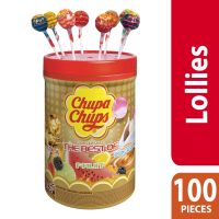
Chupa Chups The Best of Assorted 100s - 1 jar
₱1,041.00
Buy on Lazada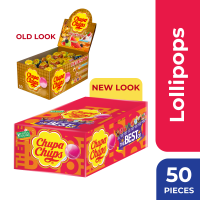
The Best of Chupa Chups Lollipops 50s - 1 box
₱521.00
Buy on Lazada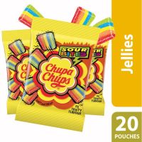
Chupa Chups Sour Bites 20g - 20 sachets
₱310.00
Buy on Lazada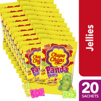
Chupa Chups Jellies Panda Bears 20g - 20 sachets
₱341.00
Buy on Lazada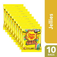
Chupa Chups Sour Bites 45g - 10 bags
₱302.00
Buy on Lazada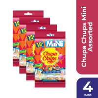
Chupa Chups Mini Assorted 15s - 4 bags
₱223.00
Buy on Lazada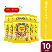
Chupa Chups Cool Cola 45g - 10 bags
₱332.00
Buy on Lazada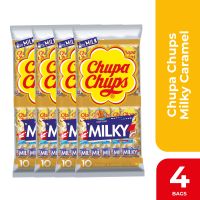
Chupa Chups Milky Caramel Lollipop 10s 4 bags
₱229.00
Buy on LazadaAbout Chupa Chups
Chupa Chups is a Spanish confectionery brand best known for its brightly coloured lollipops—round or shaped candies mounted on sticks. Founded in 1958 by Spanish confectioner Enric Bernat, the brand transformed the traditional candy market by creating a lollipop designed to be cleaner and easier for children to eat. Today, Chupa Chups is part of the Italian-Dutch confectionery group Perfetti Van Melle.
The brand’s identity is particularly famous for its daisy-shaped logo, created in 1969 by surrealist artist Salvador Dalí. The combination of the lollipop format, vivid colours, playful typography, and the Dalí-designed logo has made Chupa Chups one of the most recognisable candy brands globally 1.
Brand overview
| Category | Information |
|---|---|
| Brand name | Chupa Chups |
| Founded | 1958 |
| Founder | Enric Bernat |
| Country of origin | Spain |
| Original business | Confectionery / candy |
| Best known for | Lollipops |
| Parent company | Perfetti Van Melle |
| Iconic designer | Salvador Dalí |
| Famous logo introduced | 1969 |
| Brand positioning | Fun, colourful, playful confectionery |
| Global reach | Sold internationally; reached 164 countries by 1990 |
Chupa Chups began as a Spanish confectionery business but subsequently became an international brand. Perfetti Van Melle acquired 100% of Chupa Chups in 2006, integrating it into a larger global confectionery group 2.
The founder: Enric Bernat
The story of Chupa Chups begins with Enric Bernat, a Spanish confectioner from a family with a long tradition in candy manufacturing.
Bernat opened a small confectionery factory in Barcelona after World War II. His family had been involved in confectionery for generations; according to Perfetti Van Melle’s history, his grandfather Joseph had begun producing sweets in Barcelona in the nineteenth century 3.
Bernat eventually identified a practical issue with how children consumed candy. Traditional hard candies were normally held in the hand or put directly into the mouth, which often resulted in sticky fingers and messy eating for children. Bernat’s solution was simple:
Put the candy on a stick.
In 1958, he introduced a round candy mounted on a stick. Perfetti Van Melle describes the concept as being inspired by the idea of eating a sweet “with a fork” 4. This modification became the foundation of the Chupa Chups brand.
The invention of the lollipop
It is important to note that Bernat did not invent the general concept of candy on a stick from nothing; similar products had existed in various forms previously. What Bernat achieved was the creation of a commercially successful, highly standardised lollipop product and brand around the concept.
His innovation addressed both product design and consumer behaviour. The stick served multiple functions:
- Made the candy easier to hold
- Reduced direct contact between the hand and the candy
- Made consumption easier for children
- Created a visual distinction from ordinary sweets
- Provided a natural “handle” for packaging and display
The product solved a practical problem while establishing a memorable new category of branded candy. This combination of function, distinctive shape, and strong branding became central to Chupa Chups.
The original name
The product was not immediately named “Chupa Chups”. The brand underwent several naming stages. Company history indicates that the original name was “GOL”, apparently because the candy resembled a football sitting in an open mouth. The name was subsequently changed to “CHUPS” around 1960 5.
An advertising jingle was later built around the phrase:
“Chupa… chupa… chupa un CHUPS.”
The jingle gained popularity with consumers, and the company adopted Chupa Chups as the permanent brand name in 1963. The name derives from the Spanish verb chupar, meaning “to suck” or “to lick/suck on,” making it a playful reference to the action of consuming the candy.
The breakthrough: branding
While the lollipop itself was innovative, Chupa Chups became an iconic brand because Bernat understood that the product required a strong visual identity. Rather than treating the lollipop as merely a cheap children’s sweet, the company invested heavily in packaging, advertising, colours, and recognisable branding. This approach proved particularly significant during the 1960s and led to one of the most unusual collaborations in confectionery history.
Salvador Dalí and the famous logo
In 1969, Enric Bernat commissioned legendary Spanish surrealist artist Salvador Dalí to help redesign the Chupa Chups logo. According to Perfetti Van Melle, Dalí sketched the basis of the logo during lunch with Bernat, completing the design in less than an hour.
The resulting design placed the Chupa Chups name inside a bright, daisy-like flower shape. This was a strategic branding decision. Instead of placing the logo inconspicuously on the packaging, the design was intended to be highly visible even when the candy was attached to its stick. The flower-like shape created visual associations with happiness, youth, colour, fun, friendliness, and playfulness. Most importantly, it gave Chupa Chups an identity recognisable before consumers even read the name.
The logo has since become one of the most famous examples of a major commercial brand identity associated with a celebrated artist 1.
Importance of the Dalí logo
The significance of the logo extends beyond Salvador Dalí’s involvement; it effectively solved a specific branding challenge. As a small product, a lollipop offers limited space for communication on its package and stick. Dalí’s design functioned as a visual badge that could appear on:
- Individual lollipops
- Wrappers
- Display boxes
- Advertisements
- Merchandise
- Retail displays
- Different flavours and product variations
Consequently, even as the company’s products evolved, the basic brand identity remained recognisable. Perfetti Van Melle continues to describe the Dalí-designed daisy as the iconic Chupa Chups logo.
International expansion
Chupa Chups gradually expanded beyond Spain. By 1990, the company reported that its products were being sold in 164 countries, demonstrating significant international growth by the end of the twentieth century.
This achievement was notable because the lollipop is a simple product understood almost universally, making the brand well-suited for international markets. The company preserved the basic concept while adapting flavours, packaging, advertising, product formats, language, and seasonal offerings to different regions.
Product range
Although “Chupa Chups” is often used synonymously with the classic lollipop, the brand has expanded significantly beyond its original product. Perfetti Van Melle describes Chupa Chups as “more than a lollipop,” offering a variety of formats 6. Depending on the market and period, product categories have included:
Classic lollipops
The core product remains the traditional Chupa Chups candy on a stick. Different markets offer numerous flavours and combinations, including fruit-oriented varieties.
Filled and specialty candies
The brand has developed various candy formats beyond the original hard lollipop.
Bubble gum
Chupa Chups has extended its brand into bubble gum products.
Novelty products
The brand frequently uses unusual shapes, packaging, and combinations to maintain its playful personality.
Seasonal and limited-edition products
Special packaging and limited-run products are used regularly to keep the brand contemporary.
The exact assortment differs considerably between countries.
Brand personality
A key factor in the brand’s longevity is that Chupa Chups does not position itself primarily as a sophisticated confectionery product. Its personality is rooted in fun. Perfetti Van Melle describes the brand using the concept “Forever Fun” 6.
The personality can be summarised as playful, colourful, youthful, energetic, slightly mischievous, and nostalgic. This positioning allows Chupa Chups to appeal to children while simultaneously resonating with adults who remember the product from their own youth. Consequently, it functions as both a children’s brand and a nostalgia brand.
Target audience
Historically, children have been a primary audience for Chupa Chups. However, the brand’s positioning is broader than simply “candy for children.” Its visual identity allows it to appeal to:
- Children through colour, flavour, and playfulness
- Teenagers through fashion, pop culture, and novelty
- Young adults through design and lifestyle collaborations
- Older consumers through nostalgia and childhood memories
This broad appeal is valuable for a confectionery brand. A consumer might first encounter Chupa Chups at age six, yet the brand remains recognisable decades later.
Packaging and visual identity
Chupa Chups packaging is highly recognisable due to several recurring elements:
Bright colours
Different flavours often receive distinctive colour treatments, creating a visually energetic product range.
The flower logo
The Dalí-inspired logo provides a consistent visual anchor across products.
Round candy form
The traditional round lollipop shape is intrinsic to the brand’s identity.
Stick
The stick is not merely functional; it is a defining part of the product silhouette.
Playful typography and graphics
Chupa Chups frequently uses expressive, youthful graphic design rather than the restrained visual language associated with premium food brands.
Together, these elements create strong shelf impact, allowing consumers to recognise a Chupa Chups product from several metres away.
Marketing strategy
Chupa Chups marketing has historically relied on the premise that candy should be fun rather than serious. Key strategies include:
Strong visual recognition
The Dalí logo provides an instantly identifiable visual signature.
Product novelty
New flavours, formats, and designs prevent the brand from appearing static.
Youth culture
The brand frequently connects itself with youth, fashion, entertainment, and pop culture.
Collectability
Colourful wrappers, unusual formats, and special editions encourage consumers to try different versions.
Nostalgia
The enduring Chupa Chups shape makes it easy for adults to associate the brand with childhood.
Popular culture
Chupa Chups has crossed the boundary between food product and lifestyle object. The logo and wrapper have appeared on merchandise and fashion-oriented products, while the distinctive visual language has been used in collaborations and promotional campaigns.
This is significant because confectionery is typically a low-cost, disposable category. Chupa Chups has nevertheless created a visual identity strong enough to exist outside the candy itself, a hallmark of a powerful consumer brand.
Acquisition by Perfetti Van Melle
Chupa Chups remained a family-owned Spanish business for much of its history. In 2006, however, Perfetti Van Melle acquired 100% of Chupa Chups 2.
This acquisition integrated Chupa Chups into a major international confectionery portfolio alongside brands such as Mentos, Fruittella, Alpenliebe, Big Babol, Smint, and other confectionery and chewing-gum brands. Perfetti Van Melle itself was formed in 2001 when Italian confectionery company Perfetti acquired Dutch confectionery company Van Melle 7.
Today, Chupa Chups is best understood as a Spanish-origin global candy brand owned by an Italian-Dutch confectionery group.
Chupa Chups today
Chupa Chups remains one of Perfetti Van Melle’s flagship brands. The parent company describes it as a brand that has brought happiness to consumers since 1958, emphasising its combination of traditional identity with contemporary creativity and innovation 8.
The brand is no longer restricted to the original simple lollipop. It has developed a broad range of formats while retaining the visual identity established decades ago. Its continued success stems from a specific balance:
The product keeps changing, but the brand remains recognizable.
New flavours, formats, and marketing initiatives can be introduced without abandoning the familiar Chupa Chups identity.
Major historical timeline
| Year | Event |
|---|---|
| 1958 | Enric Bernat introduces the candy-on-a-stick concept that becomes Chupa Chups |
| 1960 | The product adopts the name CHUPS |
| 1963 | The brand becomes Chupa Chups, inspired by a popular advertising jingle |
| 1969 | Salvador Dalí creates the basis of the famous daisy-shaped logo |
| 1990 | Chupa Chups reports distribution in 164 countries |
| 1994 | Chupa Chups launches Smint, expanding into adult confectionery |
| 2001 | Perfetti and Van Melle merge to create Perfetti Van Melle |
| 2006 | Perfetti Van Melle acquires 100% of Chupa Chups |
| 2010s–2020s | The brand continues expanding its product formats, packaging, and international presence |
Sources: Perfetti Van Melle and official Chupa Chups histories 10.
Distinctive branding system
From a branding perspective, Chupa Chups is notable because the product, name, packaging, and logo all reinforce one another. The system operates as follows:
Candy
↓
Candy on a stick
↓
Easy-to-hold product
↓
Distinctive silhouette
↓
Memorable name
↓
Colourful packaging
↓
Dalí-designed logo
↓
Global visual identity
This coherence is unusual for a mass-market candy brand. The company created not merely a candy, but a recognisable visual and physical object.
Brand strengths
Strong recognition
The logo and lollipop silhouette are recognisable internationally.
Simple product proposition
Consumers immediately understand what the product is.
Emotional appeal
The brand is associated with childhood, fun, and positive emotions.
Distinctive visual identity
The Dalí logo provides a unique historical narrative.
Global scalability
The lollipop format is easy to understand and market across cultures.
Long heritage
More than six decades of history provide substantial brand equity.
Product flexibility
The identity applies effectively to lollipops, gum, candy, and novelty products.
Challenges
Like any established confectionery brand, Chupa Chups faces changing consumer expectations. Major challenges include:
- Increasing interest in healthier lifestyles
- Concerns about sugar consumption
- Competition from numerous inexpensive confectionery brands
- Changing children’s entertainment and media habits
- Maintaining relevance among younger consumers
- Balancing nostalgia with contemporary design
- Adapting products to different regulatory environments
The central challenge is not simply selling more lollipops, but determining how a 1958 candy brand can remain culturally relevant to consumers who did not grow up with it. Contemporary product innovation and marketing are therefore essential.
Branding case study
Chupa Chups demonstrates several classic principles of successful branding:
Make the product distinctive
Putting candy on a stick gave the product a unique physical identity.
Give the brand a memorable name
“Chupa Chups” is unusual, rhythmic, and closely connected to the act of consumption.
Build a recognisable symbol
The flower-shaped Dalí logo became a visual shortcut for the entire brand.
Keep the core identity consistent
Even as products and markets change, the basic brand remains recognisable.
Turn a commodity into a brand
Candy is fundamentally a commodity category. Chupa Chups transformed a simple sugar confection into a branded experience.
Cultural significance
Chupa Chups represents an intersection of Spanish industrial history, children’s culture, graphic design, advertising, internationalisation, and pop culture.
The Salvador Dalí connection is particularly unusual. Few everyday food products can claim that their corporate visual identity was designed by one of the twentieth century’s most famous surrealist artists. This association has helped elevate Chupa Chups from an ordinary confectionery product into a recognisable piece of commercial design history 11.
Summary
Chupa Chups is a Spanish-origin confectionery brand founded in 1958 by Enric Bernat, who popularised the modern mass-market lollipop by placing a round candy on a stick. Initially developed to make candy easier and cleaner for children to eat, the product evolved into a powerful global brand through distinctive naming, colourful packaging, and advertising. The brand became particularly famous in 1969 when Spanish surrealist artist Salvador Dalí designed the basis of its iconic daisy-shaped logo. Chupa Chups expanded internationally and by 1990 reported sales in 164 countries. In 2006, it was acquired by Perfetti Van Melle, where it remains one of the group’s major confectionery brands. Today, Chupa Chups represents a combination of playful candy, strong visual identity, childhood nostalgia, and international pop culture 8.
Core brand elements
The Chupa Chups story can be distilled into five fundamental ideas:
🍭 Product: Candy on a stick
🇪🇸 Origin: Spain, 1958
👨💼 Founder: Enric Bernat
🎨 Icon: Salvador Dalí’s 1969 logo
🌈 Brand idea: Forever Fun
This combination explains why Chupa Chups has remained recognisable for more than 65 years 9.
References
- Perfetti Van Melle | Our brands | Chupa Chups
- Our history | Chupachups
- Our history | Chupachups
- Notre histoire | Chupachups
- Historia | Chupachups
- Perfetti Van Melle Chupa Chups
- Storia | Chupachups
- Our history | Chupachups
- Chupa Chups Geschichte | Chupachups
- Naše historie | Chupachups
- #dali #salvadordali #logos #ipinhistory | EUIPO – European Union Intellectual Property Office