Shop on Lazada
CryingCenter products
Crying Center | Classic Mini Backpack for Toys Babysitting Hiking Picnic
₱1,827.20
Buy on Lazada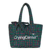
CryingCenter | Multicolor Retro Plaid Tote Bag
₱1,446.14₱2,001.57
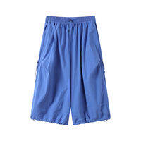
CryingCenter | Adjustable Node Capri Pants
₱2,853.92
Buy on Lazada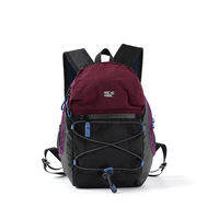
Crying Center | Color-block Outdoor Backpack
₱1,816.94
Buy on Lazada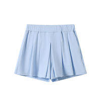
CryingCenter | Pleated Sport Skort for Women Tennis and Badminton
₱1,248.93₱1,537.52
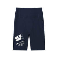
CryingCenter | Shaping Tight High Elasticity Sports Training Shorts Multiple Pockets Mens
₱1,701.91₱2,101.54
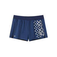
CryingCenter | Reflective Polka Dot Diamond Check Running Shorts
₱2,663.78₱3,014.33
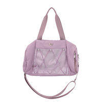
CryingCenter | Small Gym Bag
₱2,350.46
Buy on LazadaAbout CryingCenter
CryingCenter (哭喊中心) is an independent Chinese fashion and streetwear label established in Guangzhou, Guangdong, in 2017. The brand is recognized for merging accessible pricing with experimental, expressive design, building its identity around emotion, youth culture, individuality, and creative freedom.1 Originally a young designer-clothing label, it has evolved into a prominent name within China’s street-fashion scene, offering products that span clothing, bags, accessories, and lifestyle goods.2
Overview
| Category | Information |
|---|---|
| Brand name | CryingCenter / Crying Center |
| Chinese name | 哭喊中心 |
| Founded | 2017 |
| Origin | Guangzhou, Guangdong, China |
| Industry | Fashion / Streetwear / Lifestyle |
| Positioning | Accessible designer fashion / Chinese streetwear |
| Style | Urban, street, sporty, unisex, experimental |
| Core audience | Young consumers and street-fashion communities |
| Main products | Clothing, bags, hats, accessories and lifestyle products |
| Key visual identity | “3C” logo, high-contrast graphics, expressive characters |
| Notable IP | 泪仔 “Tearer” and 泪仔女孩 |
| Official site | crying.center |
History
CryingCenter was founded in Guangzhou in 2017 by a collective of young designers. Rather than centering the brand on a single permanent creative director, the company adopted a distinctive model where different designers rotate to lead specific seasons.3 This approach ensures that each collection can differ substantially from the last while remaining anchored to the broader CryingCenter identity. The rotating-design system treats every season as a new creative experiment, offering consumers a sense of discovery rather than confining the brand to a narrow aesthetic.3
Growth has been closely tied to younger Chinese consumers, with secondary industry sources reporting millions of followers accumulated within the first several years.1 By the early 2020s, the brand expanded its physical retail footprint beyond Guangzhou to include stores in Beijing and Chengdu.1
Name and Philosophy
The Chinese name “哭喊中心” translates roughly to “Crying Center” or “Cry-and-Shout Center.” The name is intentionally emotional; rather than framing sadness, frustration, or anxiety as feelings to be hidden, CryingCenter incorporates emotional expression into its cultural identity. In this context, “crying” signifies giving young people permission to express themselves authentically.1
A core brand philosophy is summarized by the phrase “昂贵与便宜等价,” meaning “expensive and cheap are equivalent.” This concept asserts that design value need not correspond to a high price point. CryingCenter aims to provide visually distinctive, designer-oriented products at accessible prices, allowing younger consumers to participate in fashion without the financial barriers typical of independent designer labels.1 This combination of design and affordability remains central to the brand’s appeal.
Design Philosophy
CryingCenter avoids adhering to a single rigid visual style. Collections frequently shift between streetwear, casual fashion, sport-inspired clothing, Y2K influences, graphic T-shirts, vintage aesthetics, unisex silhouettes, playful graphics, experimental prints, and outdoor styling. Industry descriptions characterize the brand as relaxed, urban, sporty, cheerful, unisex, and accessible, noting its deliberately unrestricted design language.2 This diversity is a direct result of the rotating-designer system, which treats change itself as a fundamental component of the brand identity.3
Visual Identity
The 3C Logo
The “3C” logo is one of the brand’s most recognizable elements. Representing “CHINA Crying Center,” the mark appears across clothing, graphics, packaging, and other materials.1 Beyond identification, the logo is frequently transformed and reinterpreted, functioning as a standalone graphic design element.
Color
The brand favors bold, high-contrast, and visually energetic color combinations over conventional luxury aesthetics. This visual communication strategy is designed to elicit an immediate emotional reaction and serves as a signature in social media environments.3
Tearer Characters
In its fourth year, CryingCenter introduced an original character named “Tearer” (泪仔), based on tear imagery, which became integral to its visual system.1 A second character, “泪仔女孩,” followed in 2023. Both appear on clothing, stickers, and promotional materials, reinforcing the idea that emotion can be playful, fashionable, and expressive rather than solely negative.3
Product Range
While primarily known for apparel, CryingCenter operates a broader product ecosystem. Current categories include T-shirts, long-sleeve shirts, hoodies, sweatshirts, jackets, knitwear, pants, sportswear, bags, backpacks, hats, small accessories, and lifestyle products. Regional listings, such as those for Taiwan, feature Boston bags, crossbody bags, earphone cases, and keychains alongside clothing.4 This breadth positions CryingCenter as a comprehensive fashion and lifestyle brand rather than a traditional streetwear label.
Streetwear and Youth Culture
CryingCenter’s cultural positioning is deeply connected to the everyday emotional lives of young people. Instead of relying exclusively on traditional product advertising, the brand develops content centered on youth lifestyles, humor, outfits, emotions, and social interaction. Analyses of its social media strategy note a focus on the daily lives and interests of its audience rather than mere product features. This approach allows the brand to sell a cultural attitude alongside its garments, communicating that one can be emotional, unconventional, or frustrated and still belong. This attitude enables the brand’s identity to extend beyond its physical products.
Marketing and Collaborations
Collaborations and events have been instrumental in broadening the brand’s cultural footprint. Partnerships have included Hope Water (好望水), KUMOKUMO, FIRST, HBDBURGER, and Nestlé China. These projects allow CryingCenter to apply its visual language across diverse contexts—including food, entertainment, and youth culture—rather than limiting it to fashion advertising. Additionally, offline activities bring together individuals with shared interests, reinforcing the brand’s status as a community as well as a clothing label.
Brand Positioning
CryingCenter occupies a unique space in the fashion market, situated between independent designer brands, Chinese streetwear, youth fashion, and accessible lifestyle labels. Its competitive proposition combines distinctive design, affordable pricing, emotional identity, and constant variation. While traditional designer fashion often emphasizes exclusivity and fast fashion prioritizes accessibility over originality, CryingCenter bridges these models by making fashion feel culturally meaningful and designed while remaining accessible to younger consumers.1
Key Differentiators
- Rotating Designers: Seasonal rotation prevents visual repetition and introduces diverse creative perspectives.3
- Emotion as Branding: The concept of “crying” provides the foundation for communication and visual language.
- Affordable Designer Positioning: Emphasizing that good design need not be expensive appeals to younger demographics.
- Strong Visual Symbols: The 3C logo, tears, and Tearer characters connect otherwise disparate collections.
- Unisex Orientation: Products and styling blur traditional gender boundaries, supporting a wider audience.2
- Community Focus: Social content and offline activities create an environment around the brand rather than treating interactions solely as advertisements.
International Presence
Although rooted in Guangzhou, CryingCenter’s influence has extended beyond mainland China. The brand has appeared in international fashion contexts such as Pitti Immagine Uomo, where it was presented under the China Wave program. Its exhibitor profile described the brand as a design and sport community centered on the relationship between soul/body and tears/sweat.2 Visibility on overseas-facing retail and fashion platforms further suggests an expanding Asian and international audience.5
Brand Evolution
CryingCenter’s identity continues to evolve. Earlier associations focused on Chinese youth streetwear, graphic T-shirts, affordable designer fashion, and emotional expression. More recent descriptions emphasize sport, outdoor influences, lifestyle, community, and international fashion. Coverage has noted a growing relationship with climbing and outdoor visual language, while its Pitti profile highlights connections between sport, body, sweat, and emotion.2 This trajectory indicates a shift from a purely streetwear label toward a broader youth lifestyle and design brand.
Cultural Significance
CryingCenter represents a significant development in China’s contemporary fashion industry: the emergence of brands that build identities around local youth culture and emotional expression rather than imitating Western streetwear models. The use of “cry” is particularly notable; in a culture where negative emotions may traditionally be suppressed, the brand reframes crying as a celebratory, legitimate aspect of youth. Its central message—that emotion is not weakness and expression can be stylish—unifies the brand’s name, characters, graphics, and social media presence.
References
- 哭喊中心CryingCenter品牌资料_视觉_推广_消费者
- CRYING CENTER-CHINA WAVE
- [[脚本]:哭喊中心CryingCenter品牌手册 – 发现报告](https://www.fxbaogao.com/detail/4606658)
- CryingCenter 哭喊中心
- CryingCenter แบรนด์ที่เชื่อว่าอย่ากลัวที่จะร้องไห้ เพราะยังไงเราก็เท่ที่สุด | Biztory EP.45 – Capital Listen | Podcast on Spotify